
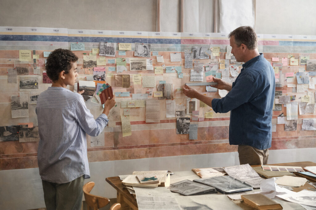
Timelines are powerful tools for summarizing historical change, connecting events across time, and highlighting long-term trends that might otherwise remain hidden. They must balance event density with readability so that viewers can follow sequences, retain a sense of causality, and avoid becoming overwhelmed by minutiae. Effective timelines establish clear priorities, using scale, layout, and typographic choices to guide attention toward significant patterns and reveal recurring themes. Choosing an appropriate scope and level of detail helps preserve narrative coherence while supporting different user goals and permitting meaningful nuance.
Define scope and audience
Start by defining the timeline’s purpose: educational overview, research reference, or public exhibition with interactive features to explore complexity. Identify the target audience and tailor terminology, granularity, and visual complexity accordingly, taking into account prior knowledge and likely questions from users. Decide on temporal boundaries and whether the timeline emphasizes individual dates, durations, thematic arcs, or comparative timelines that run in parallel. A clear scope prevents clutter, supports prioritized storytelling, and makes subsequent design decisions easier to justify to collaborators.
Prototype different scopes with short annotated examples to see how patterns appear at varying scales. Early testing with representative readers reveals whether the chosen level of detail supports comprehension and fulfills the project’s goals.
Establish visual hierarchy and scale
Visual hierarchy lets viewers scan quickly and then dive deeper into relevant segments; use size, weight, color, and placement to differentiate primary events from supporting items and reserve stronger contrast for focal points. Select a temporal scale that matches the narrative: too compressed a scale flattens causality, while too expanded a scale creates spurious gaps and reduces comparative clarity. Group related items into lanes or bands to separate chronological flow from thematic threads, and apply consistent spacing and typographic rhythm to maintain legibility across dense sequences. Consider interactive affordances that allow secondary layers to appear on demand, preserving initial clarity while offering depth for curious users.
Use legends, consistent markers, and typographic conventions to encode significance without overwhelming the main line. Thoughtful default views that reveal a clear pattern help audiences orient before they explore additional details.
Context, sources, and interpretive notes
Context transforms lists into narratives: brief captions, maps, and explanatory notes help viewers understand significance, relationships, and long-term consequences rather than just chronology. Cite sources clearly and indicate uncertainty where dates or attributions are contested to build trust and encourage further inquiry, particularly for timelines used in educational or research settings. Provide links or references to archival materials, digitized documents, or bibliographic entries so motivated users can investigate primary evidence and differing interpretations. Balancing narrative voice with evidentiary transparency strengthens both accuracy and engagement.
Include a concise source panel or methodology note that explains selection criteria without interrupting the main flow. Clear documentation supports reuse and invites community feedback for ongoing improvement.
Conclusion
Designing an effective historical timeline requires deliberate choices about scope, visual hierarchy, and transparent sourcing to balance depth with clarity. Iterative testing with representative users and gradual refinement ensure the timeline communicates major patterns while allowing access to richer detail. When well designed, timelines reveal connections, support interpretation, and invite ongoing exploration by diverse audiences.