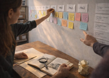
Well-crafted historical timelines help readers orient themselves in time while revealing relationships between events and trends. Effective timelines combine clear visual hierarchy, accurate research, and thoughtful narrative choices to guide interpretation. Whether used online, in galleries, or in educational materials, they must balance detail with legibility to avoid overwhelming users. This article outlines practical design principles and workflow suggestions to build timelines that communicate context, causality, and continuity.
Timelines are storytelling tools built on chronological structure, but good storytelling requires editorial decisions. Prioritizing what to include and how to present it increases both usability and impact.
Principles of Clarity and Hierarchy
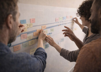
Clarity begins with a distinct visual hierarchy that separates major periods, key events, and supporting details. Use size, color, and spacing to differentiate primary milestones from annotations so that readers can scan quickly and then dig deeper. Labels should be concise and placed to minimize ambiguity, with dates rendered consistently to reduce cognitive load. A consistent typographic and color system also supports accessibility and helps users track parallel threads over time.
- Primary events: prominent markers and short descriptive titles.
- Secondary details: smaller text or expandable panels for depth.
Establishing these layers early in the design process streamlines research and layout decisions. Iterative testing with representative users will reveal where hierarchy needs adjustment.
Layering, Scale, and Context
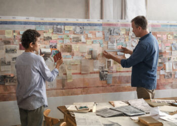
Decide on the time scale—decades, years, or days—based on the story you want to tell and the density of events available. Layered views let audiences move between broad overviews and detailed phases without losing orientation. Contextual cues, such as parallel timelines for social, cultural, or technological developments, enrich interpretation by showing simultaneity and influence. Always annotate uncertainties and sources so that the timeline remains a transparent research tool as well as a narrative device.
Providing zoom levels or filters helps manage scale and ensures that both novices and specialists can extract value. Thoughtful segmentation prevents clutter while preserving relationships across time.
Interactions, Accessibility, and Maintenance
Interactive features—like tooltips, filters, and linked documents—let users personalize their exploration and access primary sources without leaving the timeline. Accessibility considerations include color-contrast checks, keyboard navigation, and alternative text for non-text content to support diverse users. Plan for maintenance by structuring your data so updates and corrections can be applied without redesigning the layout. Well-organized metadata and clear sourcing conventions also improve long-term reliability.
- Provide keyboard and screen-reader friendly controls.
- Use modular data formats to simplify updates.
Combining interactivity with rigorous documentation sustains the timeline’s usefulness over time. Regular review cycles help keep content current and credible.
Conclusion
Designing readable, engaging historical timelines requires attention to hierarchy, scale, and user needs. Prioritize clarity, transparency, and accessibility while building flexible data structures for ongoing maintenance. These practices produce timelines that inform, invite exploration, and stand up to scrutiny.