
Timelines can do more than list dates; they shape understanding and emphasis.
A thoughtful timeline helps readers see sequences, causality, and recurring motifs.
Design choices—scope, scale, and annotation—determine how accessible that story becomes.
This article outlines practical steps to build timelines that communicate patterns and varied perspectives.
Defining scope and narrative focus
Start by choosing a clear scope and narrative focus for the timeline, deciding what span of years and which populations or themes will be included. Limit is more effective than trying to show everything; narrow choices let you show connections in more depth. Define the level of granularity—decide whether to display events by day, year, or decade—and be consistent. Document sources and selection criteria so users understand why items appear and how gaps were handled. Early editorial notes help future updates and maintain transparency about interpretive choices.
Make tradeoffs explicit in a short curator note that accompanies the timeline. Explain omissions and the criteria used to prioritize events. That context supports trust and invites checking and contribution.
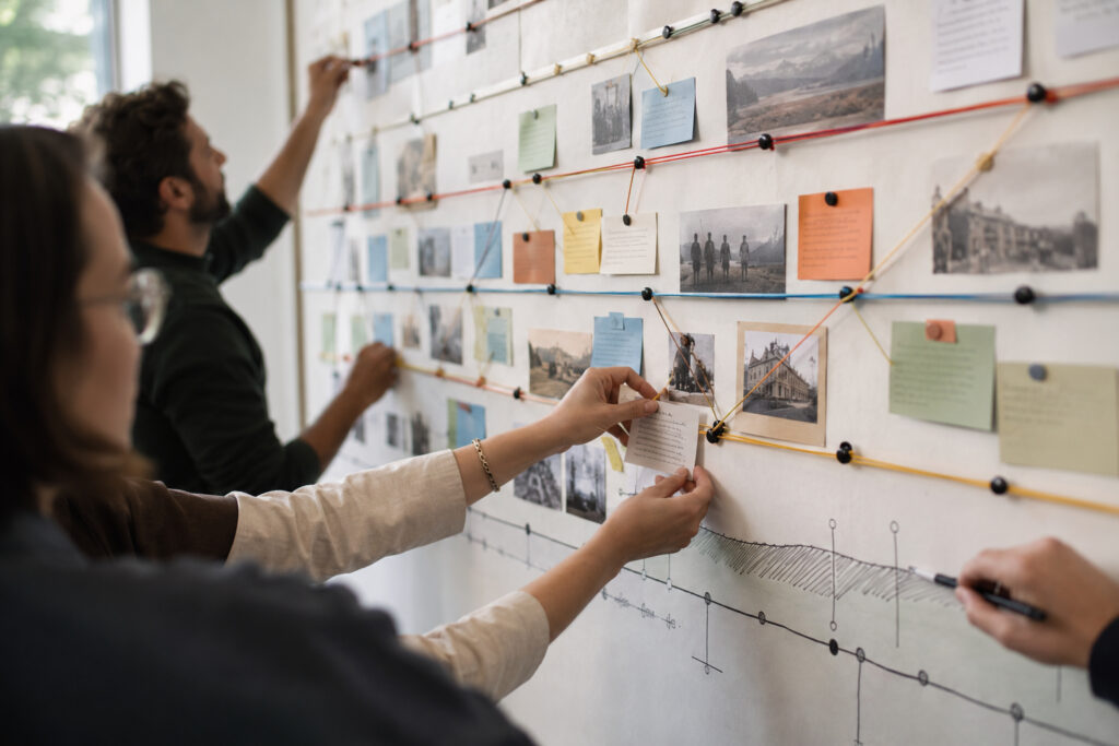
Sequencing events and emphasizing causality
Sequence matters: pure chronology can work, but thematic lanes reveal longer-running processes that cross years. Group related events into bands or threads to help readers follow multiple streams of activity without confusion. Use visual connectors—arrows, shaded ranges, or brief cause labels—to make causal links visible where appropriate. Consider nonlinear presentations for contested histories; juxtaposing concurrent perspectives can highlight divergence and dialogue. Balance density with pace by breaking complex periods into zoomed-in intervals or expandable layers.
Add signposts such as milestone icons and short headers to anchor attention. Keep explanatory text concise and link to fuller resources for readers who want more detail. These touches preserve clarity while allowing depth for interested users.
Annotating with context and primary sources
Annotations provide essential context that turns dates into stories; short, focused labels are better than long paragraphs. Where possible, include primary source excerpts, images, or linked documents to let users see evidence directly. Attribute provenance clearly so readers can assess reliability and follow up on sources. Use concise quotes and captions to humanize events without overwhelming the layout. In online timelines, provide expandable annotations or side panels for deeper context and citations.
Limit on-card text to a sentence or two and place extended material behind links. Clear attribution and accessible scans or transcripts increase trust and usability. Think of annotations as invitations to further inquiry rather than exhaustive explanations.
Visual hierarchy, scale, and accessibility
Establish a visual hierarchy with type size, weight, and color so primary events stand out while secondary items recede. Choose a consistent scale and provide rulers or time markers to help orient readers across long spans. Ensure color contrast, legible fonts, and keyboard navigation for accessibility.
Design responsively so printed and mobile versions preserve meaning and hierarchy. Test prototypes with diverse users to catch readability and interpretive issues early.
Conclusion
Timelines are interpretive tools that guide attention and meaning.
Prioritize clarity, document selection, and create pathways to deeper research.
A disciplined design process yields timelines that invite exploration and informed reflection.