
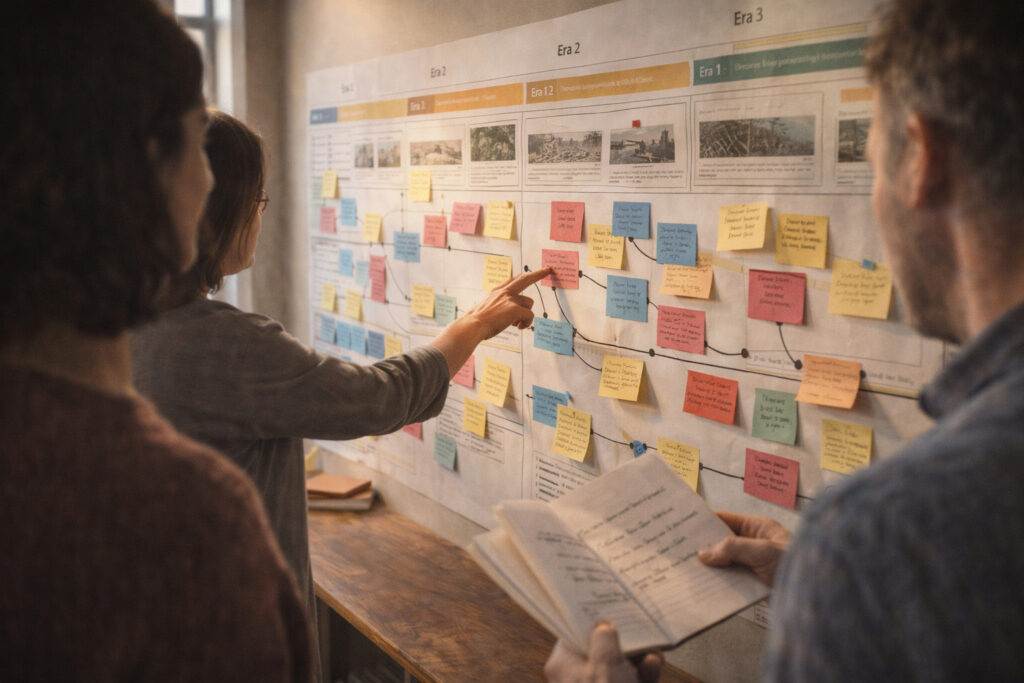
Timelines are powerful tools for making complex historical developments accessible and meaningful to the public. A well-crafted timeline balances factual accuracy with narrative clarity so visitors can quickly grasp patterns and turning points. Effective timelines foreground relationships between events, not just isolated dates, and guide viewers toward questions worth pursuing. This article outlines practical steps to shape timelines that inform, engage, and withstand public use.
Define Scope and Audience
Begin by clarifying the temporal span, geographic reach, and thematic focus of the timeline. Identify primary audiences — students, casual visitors, researchers, or community members — and consider how their prior knowledge should shape labels and explanations. Narrow scopes can illuminate causality while broader spans support long-term pattern recognition. Early decisions about scope also determine source needs and display scale.
Keeping the audience central prevents unnecessary complexity and makes editorial choices defensible. A transparent statement of scope can appear on the timeline to orient users and frame expectations.
Select Events, Narratives, and Sources
Choose events that advance a coherent narrative or reveal structural change rather than every available date. Combine political milestones with social, economic, and cultural markers to create multidimensional context. Prioritize primary and reputable secondary sources and document provenance on the timeline or in accompanying notes. When multiple interpretations exist, indicate competing perspectives rather than presenting a single, unqualified account.
Clear selection criteria improve trustworthiness and help future editors maintain consistency. Annotated references support further research and public confidence.
Design Visual Hierarchy and Scale
Visual hierarchy helps users read a timeline at a glance: major eras or themes should be prominent, while supporting details are subordinate. Use consistent spacing to represent time intervals and adjust scale where necessary, such as inset panels for dense periods. Color, icons, and typography can distinguish categories but should remain accessible and legible at different sizes. Aim for simplicity so visual cues reinforce rather than distract from the story.
Test designs at the intended display size and in different media to ensure readability. Consider responsive layouts for web presentation and tactile elements for public installations.
Iterate, Test, and Document Decisions
Prototype early and solicit feedback from target users and subject experts to catch confusing labels or gaps in context. Iteration reveals where assumptions about prior knowledge lead to misreadings, and user testing can uncover accessibility issues. Maintain versioned documentation that explains inclusion criteria, sources used, and editorial choices to support transparency and future updates.
A documented workflow streamlines revisions and helps collaborators maintain the timeline’s integrity over time. Ongoing evaluation keeps the timeline relevant as new research emerges.
Conclusion
Good timelines combine clear scope, disciplined selection, and thoughtful visual hierarchy to make history legible and meaningful.
Iterative testing and documentation safeguard accuracy and accessibility for diverse audiences.
When designed with purpose and care, timelines become platforms for public learning and civic reflection.