Timelines translate collections of dates into coherent narratives for readers.
They help audiences see sequence, causality, and patterns across periods.
A well-made timeline balances overview and detail so users can explore without feeling lost.
Good timelines foreground context, not just chronology.
This article outlines practical steps to plan, design, and maintain timelines that communicate clearly.
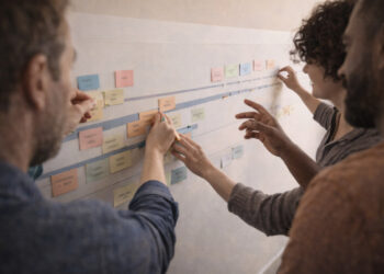
Plan with a clear narrative
Start by defining scope, audience, and the narrative you want the timeline to convey. Choose a timeframe that supports that narrative and decide which events are essential versus peripheral. Sketch a rough chronology to identify clusters, turning points, and long-term trends.
These early choices limit clutter and guide research priorities. They also set expectations for interactivity and level of detail.
Visual hierarchy and scale
Design should make temporal relationships legible at a glance. Use size, color, and positioning to signal importance, era, or theme. Decide whether to use linear scale, nested scales, or segmented bands to accommodate both macro and micro events. Test the visual hierarchy with sample datasets before finalizing.
Consistent spacing and typographic choices reduce cognitive load. Keep axis labels and markers readable at common display sizes.
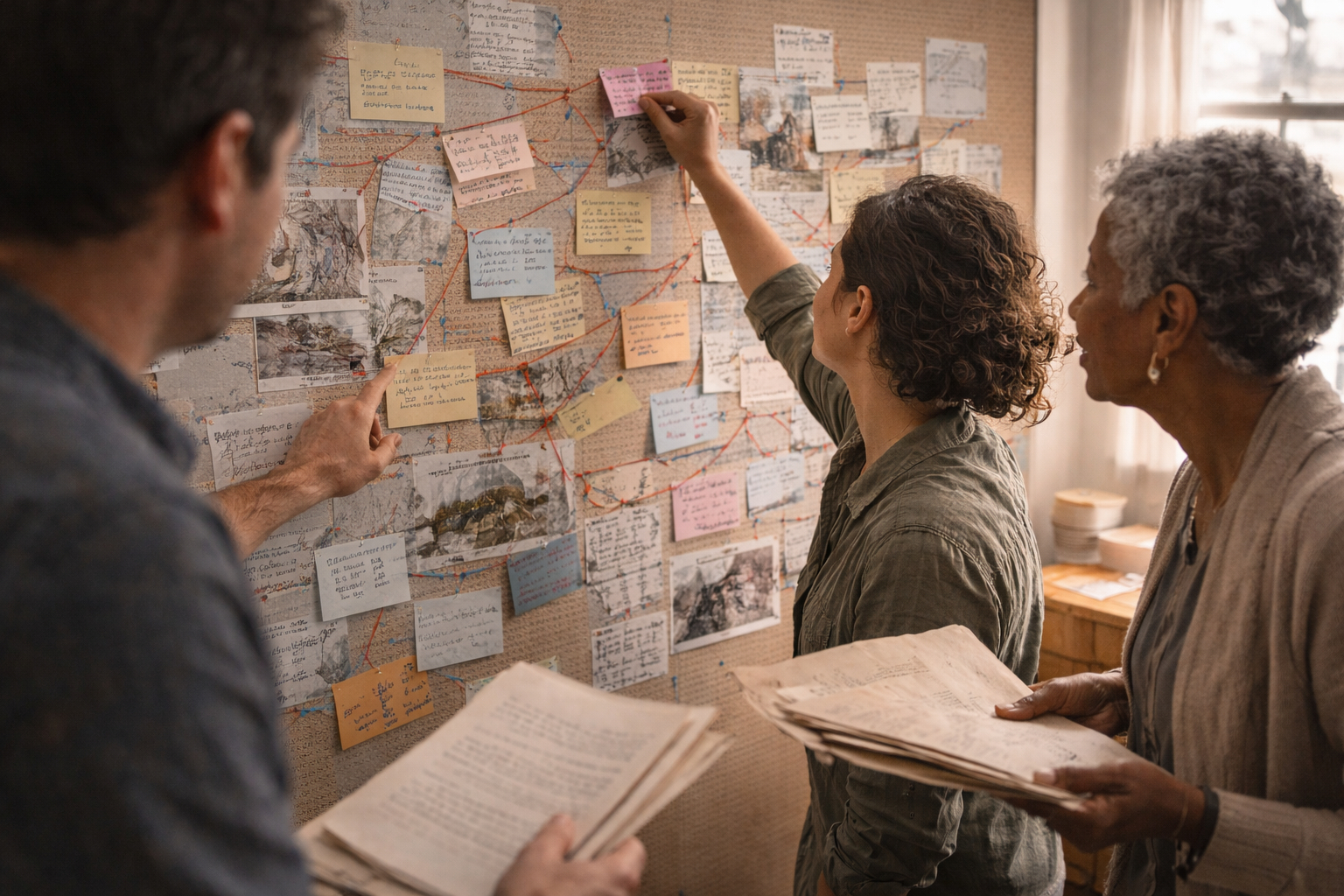
Sourcing and verification
Accurate timelines depend on traceable sources and clear attribution. Record provenance, date ranges, and confidence levels for contested items. Link to primary documents, citations, or explanatory notes so users can follow research trails. Make editorial decisions transparent to build trust with audiences.
- Event date and source
- Location and participants
- Confidence and notes
Maintain a version history and update records when new evidence emerges. Regular audits help correct errors and refine interpretations.
Interactivity and accessibility
Interactivity helps users explore dense timelines without losing orientation. Features like filtering, zooming, and contextual pop-ups let users focus on themes or scales of interest. Ensure keyboard navigation, semantic markup, and color contrast meet accessibility standards. Consider responsive layouts that adapt to narrow and wide viewports.
Balance interactivity with clear defaults so new visitors understand the core story. Provide alternate representations such as timelines as lists or maps.
Testing and iteration
Prototype timelines early and run usability tests with representative users. Observe how people navigate time ranges, interpret labels, and discover connections. Use analytics to see which segments attract attention and where drop-offs occur. Iterate designs based on evidence, not assumptions.
Collect qualitative feedback and track quantitative metrics regularly. Small improvements compound over time to make a timeline more reliable and engaging.
Conclusion
Timelines are tools for translating research into accessible narratives.
Invest in planning, clear visuals, and honest sourcing to earn user trust.
Regular testing and updates keep timelines useful as new evidence appears.