
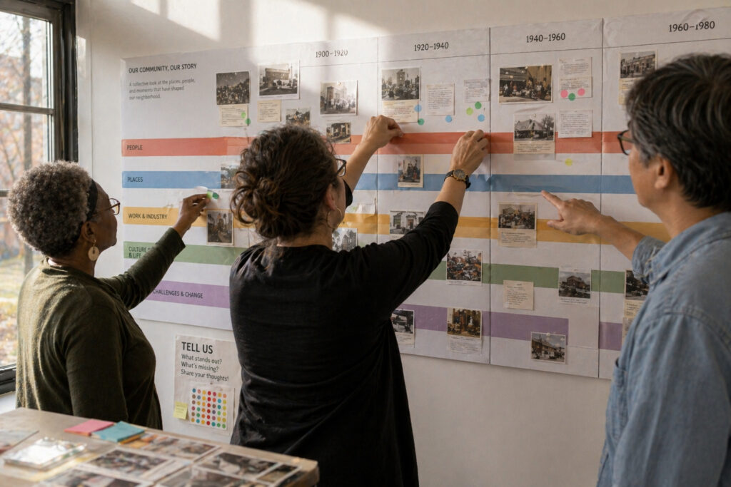
Timelines turn sequences of dates into accessible stories that help people understand change over time. When designed with clear focus and thoughtful detail, a chronology can guide curiosity without overwhelming readers. This piece outlines practical choices around scope, layout, annotation, and testing that make timelines usable for broad public audiences. It is geared toward educators, curators, and community groups who must translate research into readable displays.
Clarify Scope and Narrative Focus
Begin by defining the time span and the specific narrative you want the timeline to support. Narrower scopes let you include richer detail and personal stories, while broader spans emphasize long-term trends and comparisons. Decide whether the timeline is event-driven, theme-driven, or layered by categories such as social, economic, and cultural developments. Clear scope prevents feature creep and helps prioritize which events and voices to include.
- Choose a clear temporal window to keep density manageable.
- Select one or two thematic lenses to guide inclusion.
- Identify representative events rather than every possible date.
These choices shape both research needs and visual design. Establishing them early saves revision time and focuses interpretation for your audience.
Scale, Layout, and Visual Hierarchy
Decide on orientation and scale that suit the display context: long horizontal bands work for galleries, modular panels for touring exhibits, and vertical or zoomable digital layouts suit different audiences. Use visual hierarchy—size, color, and spacing—to distinguish major milestones from secondary notes. Maintain consistent markers for dates and units of time so viewers can read the sequence at a glance. Balance decorative elements with clarity to avoid distracting from the historical narrative.
- Use larger blocks or color accents for anchor events.
- Keep typography legible at expected viewing distances.
- Provide a clear legend for symbols and color codes.
Good layout choices reduce cognitive load and encourage exploration. A readable visual order invites visitors to make connections on their own.
Annotation, Sources, and Interactive Prompts
Annotations turn bare dates into meaningful context: brief captions, images, or primary-source excerpts illuminate why an event matters. Cite sources succinctly and offer deeper references via QR codes or companion guides for visitors who want more. Use prompts and questions to nudge interpretation without dictating conclusions, and avoid jargon that alienates general readers. Thoughtful annotation respects both accuracy and accessibility.
- Keep captions short and focused on significance.
- Include clear source attributions for credibility.
- Add interactive links for layered investigation.
Annotations bridge curiosity and scholarship, making timelines both engaging and trustworthy. They help audiences move from noticing to understanding.
Test, Iterate, and Respect Diverse Perspectives
Usability testing with representative users reveals where timelines confuse or inspire. Track which elements attract attention and which get ignored, then revise scale, wording, or layout accordingly. Engage community stakeholders to surface overlooked perspectives and ensure the timeline reflects diverse experiences and interpretations. Iteration turns an initial draft into a more resonant public resource.
- Conduct short walkthrough sessions with different audience groups.
- Collect feedback on clarity, balance, and emotional tone.
- Make incremental changes and retest until goals are met.
Testing and community input increase relevance and trust. Regular revision keeps timelines accurate and responsive to audience needs.
Conclusion
Effective public timelines combine clear scope, intentional layout, and concise annotation to make history approachable. Iterative testing and stakeholder input ensure the chronology resonates with diverse audiences. With disciplined design choices, timelines can invite discovery rather than simply list dates.