
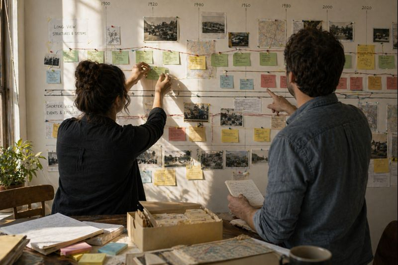
Timelines are powerful tools for turning scattered events into coherent historical narratives that readers can follow and reflect on. A well-crafted timeline balances breadth and depth so that patterns, turning points, and continuities emerge without overwhelming the audience. Effective timelines orient readers by providing clear temporal anchors, concise context, and a structure that highlights relationships among events. This article outlines practical steps for planning, curating, designing, and maintaining timelines that communicate historical meaning.
Define scope and audience
Begin by clarifying the timeline’s scope: chronological span, thematic focus, and intended audience. Establish whether the timeline targets specialists, students, or a general public, and adjust language, level of detail, and visual complexity accordingly. Define core questions the timeline should answer, such as causation, continuity, or comparison across places and institutions. These initial decisions guide research priorities and design constraints throughout the project.
Be realistic about resources and scale from the outset, setting limits on the number of events and the depth of annotation. A focused timeline with well-chosen entries often communicates more effectively than an exhaustive chronology that buries key patterns.
Curate events and provide context
Selection is interpretive: choose entries that serve the timeline’s questions and contribute to a readable narrative rather than listing every date. Prioritize events that reveal change, represent turning points, or illuminate sustained processes, and include contextual notes to connect isolated entries to broader trends. Where necessary, add short explanatory labels or one-sentence summaries that clarify significance without crowding the layout. Cite sources or link to expanded entries to support credibility and allow deeper exploration.
Consistency in how events are described—dates, actors, and outcomes—helps readers compare items across the timeline. Regular review with subject experts reduces bias and increases accuracy.
Design hierarchy and visual clarity
Use visual hierarchy to guide attention: size, color, and placement should distinguish focal events from supporting information. Group related events along lanes or bands, and consider nested layers for long-term developments versus episodic incidents. Keep typography legible and avoid dense blocks of text; white space improves comprehension and reduces cognitive load. Interactive timelines can reveal layers progressively, but static displays require careful pruning and emphasis to remain accessible.
- Use contrast for key milestones.
- Limit palette and typefaces.
- Provide scale markers and legends.
Test designs with representative users to confirm the intended reading path and revise based on feedback. Responsive layouts and clear printable versions extend usability across platforms.
Conclusion
Thoughtful timelines combine selective curation, clear context, and purposeful design to make historical change intelligible and meaningful. Iterative testing and transparent sourcing strengthen trust and usability. With attention to audience, scope, and visual hierarchy, timelines can turn dates into compelling narratives that encourage further inquiry.