
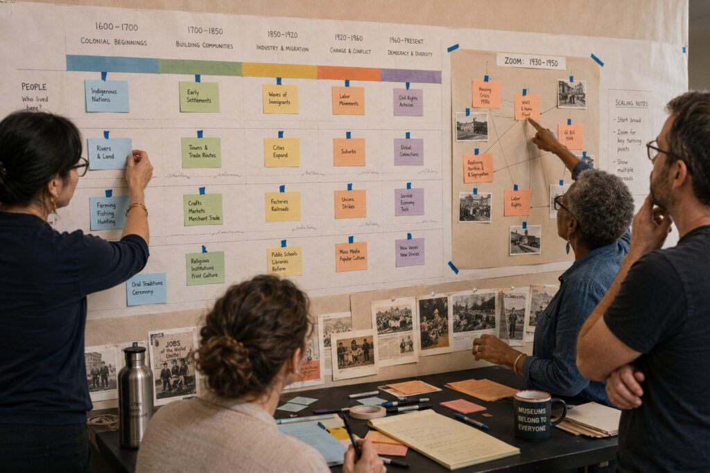
Choosing how to represent time is one of the most consequential decisions when building a public history timeline. A clear curatorial thread and a deliberate choice of scale help visitors move from isolated facts to a coherent narrative. Balancing thematic focus with representative detail allows timelines to both inform and invite inquiry. This piece lays out practical approaches to selecting threads and scales that serve diverse audiences.
Clarify the central thread
Begin by naming the single narrative or question the timeline will foreground, whether cultural change, technological adoption, or institutional development. A focused thread provides direction for selecting events and avoids overwhelming visitors with undifferentiated dates. Choose a thread that can be supported by accessible documents, objects, or testimonies so claims on the timeline remain verifiable. Keep that thread visible in labels and introductory copy so readers consistently recognize the connecting idea.
Keeping a clear thread also helps collaborators decide what to include. It guides research priorities and ensures interpretive coherence across the timeline.
Choose scale to match your story
Scale determines the rhythm of a timeline: decade-by-decade presentations suit long-term trends, while year-by-year layouts work for rapid developments. Think about temporal scope alongside spatial or social scale; a local political reform might need narrow dates but deeper contextual entries. Consider layering scales—overview bands for long arcs with zoomed panels for pivotal moments. This layered approach preserves both macro patterns and microdetails without crowding the main display.
Selecting scale deliberately also sets visitor expectations about pacing and depth. Use captions to signal shifts between broad patterns and focused episodes.
Prioritize representative events, not exhaustive lists
Resist the urge to add every documented date; select events that illustrate your thread and reflect diverse perspectives. Include counterpoints and moments of contestation to avoid a one-sided narrative, and annotate entries with sources or brief context. Where appropriate, use visual hierarchy—size, color, or placement—to distinguish turning points from supporting details. This keeps the timeline readable while honoring complexity.
Prioritization makes timelines more useful for orientation and further study. It also creates space for visitors to notice patterns rather than skim a list.
Prototype, test, and iterate with audiences
Build low-fidelity mockups and test them with representative users, including people unfamiliar with the topic. Observe what visitors notice first, where they hesitate, and which entries spark questions. Use those observations to adjust pacing, labeling, and the balance between text and visual elements. Iteration often reveals that small edits improve comprehension more than additional content does.
Testing ensures the timeline communicates as intended and reveals opportunities to add clarifying material. Revisions based on feedback strengthen both accuracy and accessibility.
Conclusion
Curating time requires firm choices about narrative thread and temporal scale. Intentional selection and user testing help timelines convey meaning without overwhelming readers. Thoughtful design invites sustained engagement and encourages further exploration.