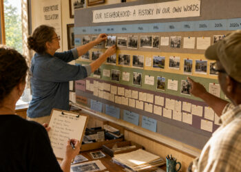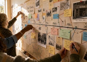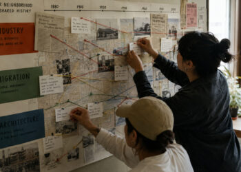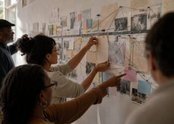

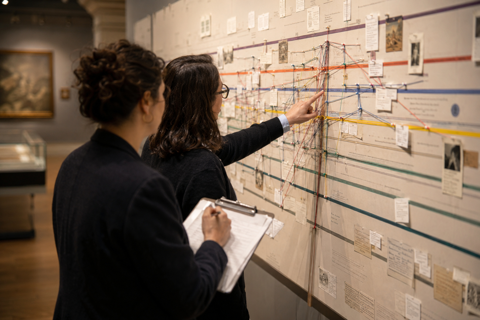
Timelines are tools for organizing events, relationships, and change across time. For public history projects, clear mapping of interconnected threads helps visitors understand complexity without being overwhelmed. This article outlines practical steps to define scope, link parallel narratives, and design visual structure so timelines communicate meaning as well as dates. These approaches balance research rigor with accessible presentation and are suitable for exhibits, educational websites, and community projects.
Define scope and narrative threads
Start by choosing a manageable time span and identifying the core threads—political, social, economic, or cultural—that will run across it. Limit scope so each thread can be followed clearly, and decide where intersections will be emphasized. Document criteria for selecting events so decisions are transparent to collaborators and audiences. A clear scope prevents clutter and creates space to show connections between threads.
Be explicit about inclusion rules and adjust scope during development. Small, well-defined timelines often do more to reveal patterns than exhaustive lists.
Design visual hierarchy and scale
Use size, color, and placement to signal importance and relationship across threads. Parallel bands or layered lanes let users scan one thread while seeing markers for others at intersections. Choose a time scale that reflects event density; compress long periods of low activity to keep focus on change. Ensure contrast and typography support legibility for diverse audiences and viewing distances.
Test layouts with sample data to find a readable balance. Iterate until hierarchy guides attention without hiding secondary details.
Integrate sources and interactive cues
Link brief citations and primary-source thumbnails to events so users can explore origins without leaving the timeline. Include hover or tap interactions that reveal additional context, alternate perspectives, or related events. Provide filters to highlight specific threads, dates, or themes and allow users to compare timelines side by side. Maintain source transparency by noting provenance and confidence for disputed dates or interpretations.
Design interactions that are discoverable and reversible to encourage exploration. Accessible controls and clear labels help visitors of varied backgrounds engage with the material.
Plan for interpretation and evaluation
Develop accompanying labels, guides, and narrative prompts that explain why connections matter and how to read the timeline. Provide short thematic essays or entry points that orient different audiences, from school groups to researchers. Include methods for gathering feedback, such as observation notes, short surveys, or analytics on interactive elements. Use evaluation findings to adjust content density, labeling, and interactive affordances in later revisions.
Regular review keeps the timeline responsive to new research and audience needs. Treat interpretation as part of the design, not an afterthought.
Conclusion
Thoughtful mapping of interconnected timelines helps audiences see patterns and the causes behind change. By defining scope, clarifying visual hierarchy, and integrating sources and interactions, you build narratives that invite inquiry. Apply these practical steps iteratively and test with real users to refine clarity and impact.