
Well-planned timelines do more than list dates; they guide readers through cause, consequence, and continuity. Defining scope and audience at the start keeps content focused and legible for intended users. Early decisions about scale, periodization, and whether to favor chronological or thematic structure determine research and design priorities. A concise orientation helps visitors engage meaningfully with the sequence of events.
Clarify Scope and Audience
Begin by defining what you want the timeline to communicate and who will use it. A public exhibit requires different pacing and labeling than a research tool, and community-focused timelines benefit from accessible entry points and clear narratives. Limiting the chronological span or breaking content into phases prevents overload and supports better annotation. Identifying core questions—such as change over time, turning points, or continuity—keeps curation purposeful.
These early choices reduce later revisions and make research tasks more manageable. They also guide how to present uncertainty or contested events so users understand limits.
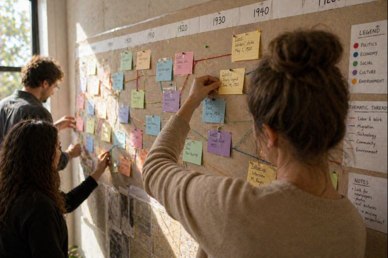
Organize Events into Narrative Arcs
Group events into thematic threads or causal chains to reveal connections without sacrificing chronology. Use anchors—milestones, representative artifacts, or emblematic dates—to help readers orient within dense sections. Consider parallel tracks for political, social, and cultural developments to show simultaneity and interaction. Limiting text on each entry preserves attention and encourages readers to follow larger patterns.
Clear arcs help audiences move from isolated facts to overarching patterns. This structure supports concise captions and optional deeper layers for further reading.
Design for Readability and Scale
Visual hierarchy—size, color, and spacing—signals what to read first and what is background. Scale choices determine how granular dates can be and whether microhistories or long-term trends will dominate the display. Use consistent typography and a restrained color palette for categories, and provide a legend to reduce cognitive load. Prototype layouts at actual display sizes to test legibility across devices or panels.
- Legend and color codes explain categories quickly.
- Interactive layers can reveal extra detail without cluttering the main view.
Iteration with representative users catches common confusions before final production. Responsive adjustments to spacing and labeling improve accessibility for diverse audiences.
Conclusion
A timeline that balances scope, narrative, and visual clarity turns dates into insight. Begin with audience and purpose, organize events into intelligible arcs, and prototype design choices early. Regular review and community feedback keep the timeline accurate and relevant to its readers.