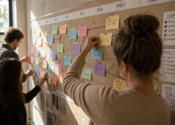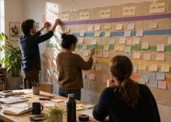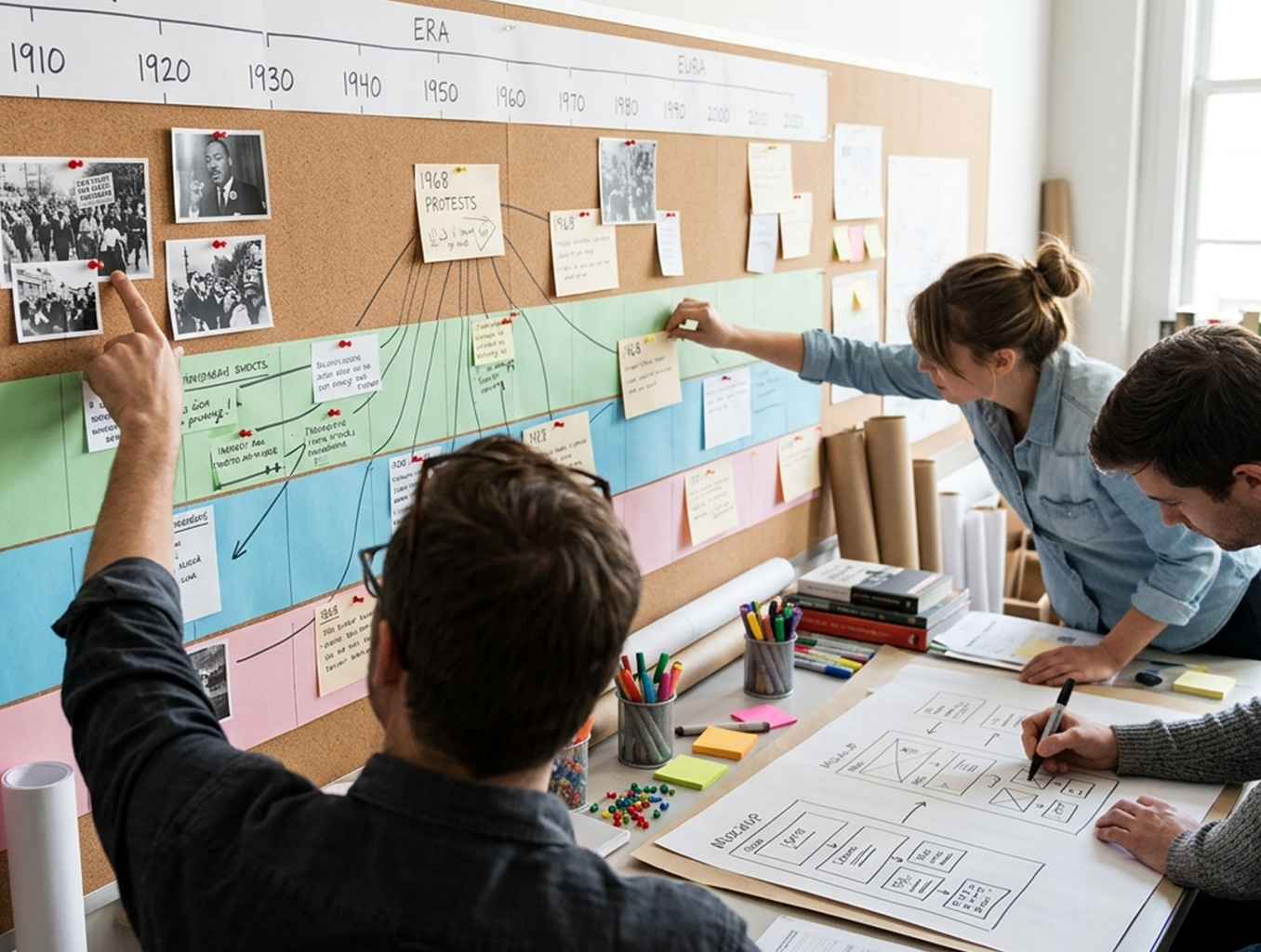
Timelines are powerful tools for organizing events and revealing patterns across eras. An interactive timeline invites readers to explore connections, view primary sources, and adjust focus to particular themes or moments. Carefully curated entries and intuitive controls prevent users from feeling overwhelmed by detail. This introduction outlines principles for designing timelines that educate while encouraging curiosity.
Why interactivity matters
Interactivity transforms a static list of dates into a learning experience that guides discovery. Users can zoom to inspect a single event, filter by theme, or compare simultaneous developments, which supports multiple learning styles. Interactive features also encourage return visits: layered content, media embeds, and tooltips let readers dig deeper without leaving the timeline. When applied thoughtfully, interactivity helps reveal causation, continuity, and change rather than merely presenting chronology.
Design choices should support narrative goals rather than novelty for its own sake. Every interactive element should have a clear pedagogical purpose, improving comprehension or accessibility.
Designing for clarity and context
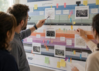
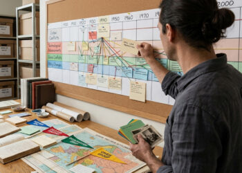
Clarity begins with consistent layout and clear visual hierarchy: date markers, color coding, and scale must be predictable so users can orient themselves quickly. Contextual cues—brief summaries, tags, and links to primary documents—help users understand why an event matters. Grouping related events into themes or lanes can reveal patterns that a single linear timeline might obscure. Accessibility matters too: readable fonts, keyboard navigation, and descriptive alt text make timelines usable by a wider audience.
Prioritize meaningful metadata and keep descriptive text concise. Clear labels and a simple legend reduce cognitive load and allow the timeline’s structure to support the content.
Tools and practical steps
Begin by defining the scope and audience: are you mapping broad movements or a focused sequence of events? Sketch the interface and determine which interactive features add value, such as zooming, filtering, or multimedia pop-ups. Select a tool or framework that fits your technical resources; many platforms support CSV imports, semantic tagging, and responsive design. Test early with representative users to find confusing controls or gaps in context.
- Plan content in tiers: brief entries for overview, extended entries for deep dives.
- Use consistent metadata fields to enable filtering and comparison.
- Iterate on usability based on feedback from target readers.
Implement in stages, starting small and building complexity as you validate assumptions. Regular maintenance keeps timelines accurate and relevant over time.
Conclusion
Interactive timelines make historical narratives more accessible by combining chronological clarity with contextual depth. Thoughtful design choices—consistent visuals, purposeful interactivity, and accessible content—help users discover connections and draw insights. With clear planning and iterative testing, timelines become lasting educational resources.