
Timelines are more than sequences of dates; they are visual narratives that guide readers through change over time. A clear visual hierarchy helps audiences identify major turning points, supporting events, and background context without overwhelming detail. Thoughtful choices in scale, grouping, and annotation let creators balance depth with readability for general audiences. This article outlines practical design principles and a compact workflow for building effective public historical timelines.
Establishing a Clear Visual Hierarchy
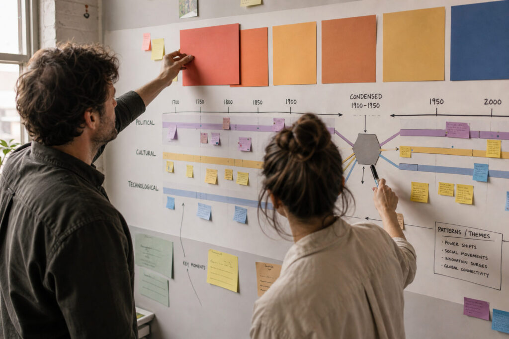
Start by deciding which events will occupy primary, secondary, and tertiary tiers on the timeline. Use size, color contrast, and spatial placement to signal importance: larger elements and stronger contrast indicate focal events, while subtler tones and smaller marks suggest supporting details. Consistent typography and iconography reduce cognitive load and let readers scan quickly for anchors in the narrative. Avoid decorative treatments that compete with informational elements, and reserve emphasis for genuinely significant moments.
Hierarchy also guides users across different time scales and densities. When decades compress into compact segments, prioritize representative milestones rather than every date. Maintain clear rules for what moves between tiers so the timeline stays coherent as content grows.
Layering Context and Scale
Contextual layers help audiences understand causation and continuity without cluttering the main sequence. Integrate parallel tracks for political events, cultural shifts, and technological change, and align them vertically or using color bands to show intersections. Use scale breaks or summary nodes where long periods of relative stability warrant condensation, and expand sections where rapid change or dense interaction occurs. Annotations, short captions, and small-callout details provide necessary context without breaking the visual flow.
Make sure contextual layers remain optional to inspect so casual readers see the broad arc while interested users can dive deeper. Interactive or physical foldouts are useful when space and medium allow.
Workflow, Testing, and Accessibility
Adopt a workflow that separates research, selection, and visual prototyping. Begin with a vetted list of events, group them thematically, and sketch multiple layouts to test different hierarchies and scales. Conduct quick usability tests with representative users to reveal confusing labels, misleading scales, or inaccessible contrasts. Iterate with clear versioning so changes in research or interpretation are documented and reversible.
Accessibility should shape color choices, label sizes, and alternate text for digital versions. Ensure high contrast, readable fonts, and keyboard or tactile navigation where relevant to broaden audience reach.
Conclusion
Effective historical timelines pair disciplined selection with purposeful design choices to make history legible and engaging. Prioritize a clear visual hierarchy, layered context, and iterative testing to address both novice and expert users. Thoughtful timelines communicate connections across time while remaining navigable and informative.