
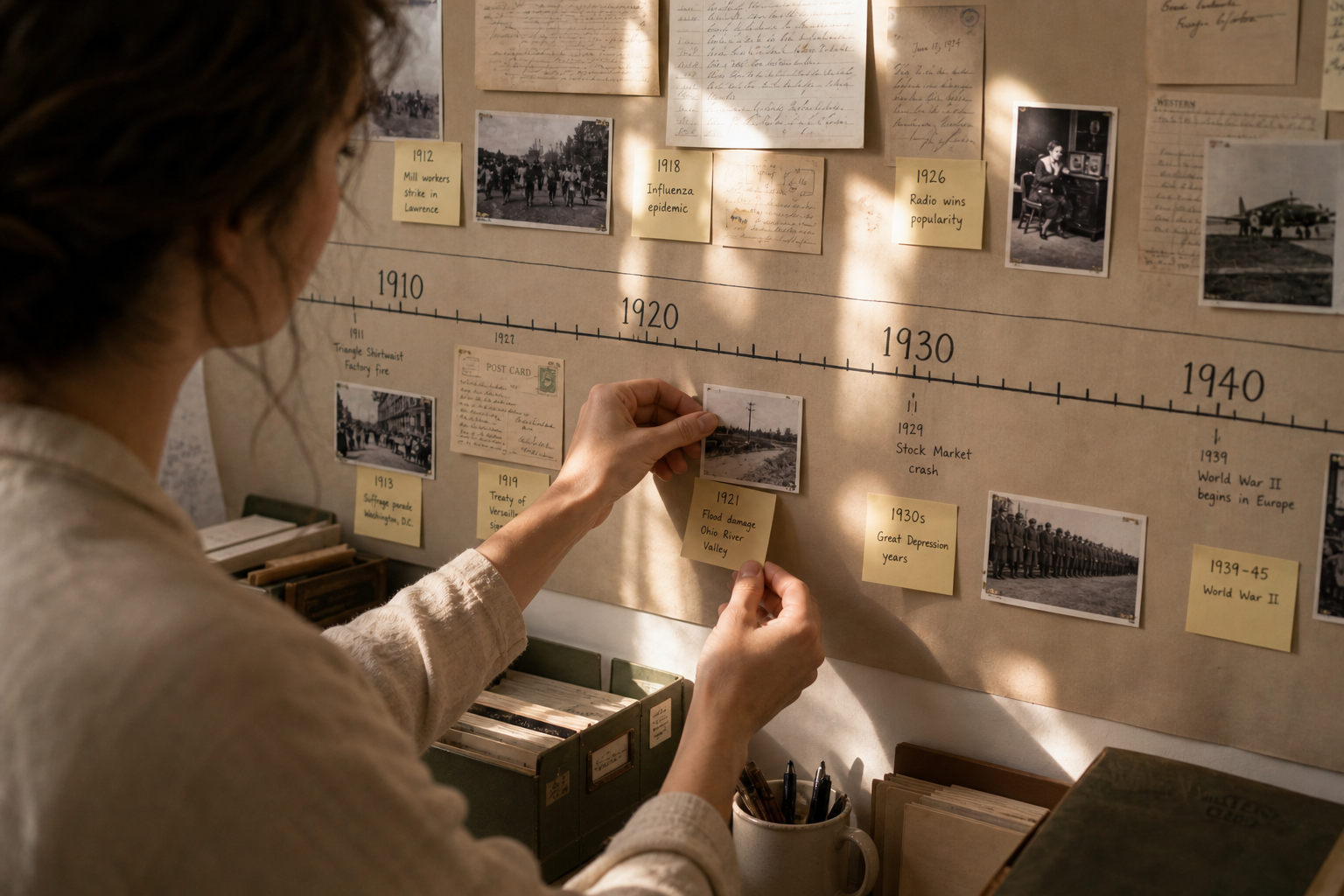
Primary sources bring texture and authority to timelines, but they can also clutter or confuse if not handled with care. Thoughtful selection and clear presentation let fragments of original material illuminate broader trends without overwhelming readers. This article outlines practical approaches for choosing excerpts, placing them in context, and designing for readability across audiences. The goal is to help timeline creators use primary evidence as a storytelling tool rather than as raw data dumped onto a chart.
Why include primary sources in timelines
Primary sources connect audiences to the lived experience behind dates and labels, offering voices, visuals, and documents that make abstract change concrete. They can reveal contested meanings, highlight underrepresented perspectives, and anchor chronology in human detail. When integrated well they build trust by showing the evidentiary basis for claims on the timeline. The challenge is balancing illustrative richness with the need for a clear, navigable narrative.
Effective use begins with clear intent: decide whether a source will illustrate a theme, support a claim, or provide an evocative counterpoint. Choosing with purpose reduces clutter and focuses attention where it matters most.
Selecting and excerpting sources
Not every document belongs on a public timeline; choose items that are representative, accessible, and legally usable. Short excerpts work best: a brief quote, a cropped image, or a dated entry that directly ties to the event shown. Provide a plain-language caption that explains why the item matters and what it reveals about the moment. Prioritize readability—avoid long quotations or dense handwriting that require deep interpretation on first glance.
Include citation details and provenance in the metadata rather than the main label, so interested users can follow up without disrupting the primary flow. This keeps the timeline lean while preserving scholarly rigor.
Visual integration and layout choices
Design decisions determine whether sources support or obscure the timeline’s narrative. Use size, contrast, and placement to create a clear hierarchy: timeline entries first, source images or quotes as supporting elements. Consider pop-ups or expandable panels for full documents so the main view stays uncluttered. Maintain consistent typography and spacing so users can scan quickly without visual friction.
- Use thumbnails for images with clear captions.
- Limit on-screen text to one short sentence per source snippet.
Responsive layouts matter: ensure excerpts remain legible on small screens and that interactive expansions are accessible to keyboard and screen-reader users.
Attribution, context, and interaction
Always attribute sources clearly and provide contextual notes that explain biases, gaps, or conflicting accounts. Where possible, offer links to full archives and suggestions for further reading to encourage deeper engagement. Interactive features—filters, thematic layers, or user comments—can let audiences explore sources without losing the timeline’s main throughline. Thoughtful annotation helps prevent misunderstanding and invites critical reading.
Design interactions that encourage curiosity while guiding interpretation; a well-annotated source can spark questions rather than present answers as absolute.
Conclusion
Primary sources, when carefully selected and clearly presented, enrich timelines by adding authenticity and nuance. Prioritize brief excerpts, purposeful placement, and transparent attribution to keep narratives accessible. With thoughtful design, original documents become gateways to deeper historical understanding.