

Introduction
Timelines translate complex sequences into a visual story that readers can follow easily. A well-crafted timeline clarifies cause and effect, highlights turning points, and supports research or teaching goals. Whether for a museum display, classroom resource, or online archive, accessibility and clarity should guide design choices. This article outlines practical approaches to make timelines informative, usable, and engaging for diverse public audiences.
Why clear timelines matter
Clear timelines reduce cognitive load by organizing events along a single continuum, helping audiences see relationships without wading through dense prose. They support multiple learning styles by combining dates, captions, and visuals to reinforce understanding. For public audiences, clarity fosters trust and encourages further exploration of primary sources or related exhibits. A transparent structure also makes it easier to update or adapt the timeline as new research emerges.
When timelines are confusing, readers can miss key connections or misinterpret sequences. Prioritizing readability and logical grouping helps retain attention and improves comprehension. Thoughtful labeling and consistent scales are simple fixes that yield immediate benefits.
Designing timelines for comprehension
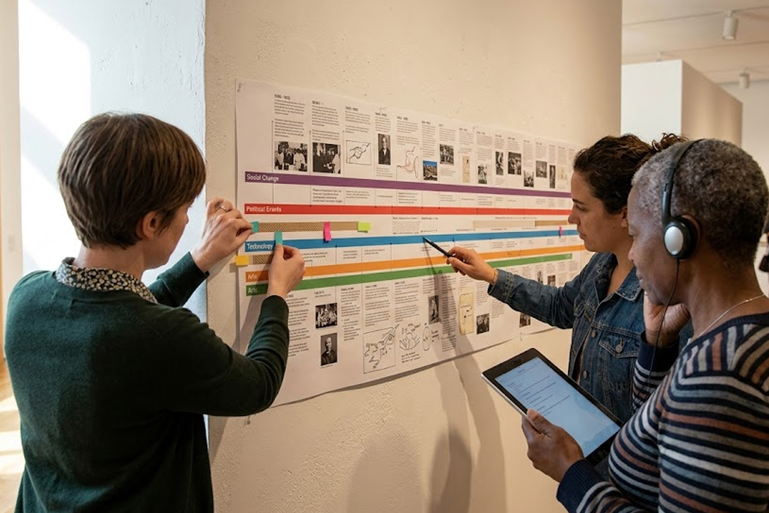
Start by defining the narrative: what story does the sequence tell and what is the central question it answers? Use clear, consistent date formats and group related events into thematic bands or color-coded lanes to show concurrent developments. Keep text concise; captions should summarize significance in one or two clauses and link to more detailed descriptions when needed. Visual hierarchy—varying font weight, size, or placement—directs readers to major milestones first and details second.
Test draft layouts with sample users to identify confusing labels or crowded sections. Iteration based on feedback ensures the final timeline communicates the intended narrative to a broad audience.
Tools and best practices
Choose tools that balance ease of use with flexibility so timelines can grow over time. Look for platforms that allow exporting, embedding, and layering of media such as images or document snippets. Prioritize responsive design so timelines remain legible on both desktop and mobile screens. Accessibility features like keyboard navigation, descriptive alt text, and sufficient color contrast broaden reach and comply with inclusive design standards.
- Use scalable vector graphics for clarity at different sizes.
- Include metadata and source citations for each event.
- Offer filters to let users focus on themes, dates, or categories.
Documenting workflows and source provenance makes maintenance straightforward and supports scholarly use. Small investments in accessibility and documentation pay off in usability and longevity.
Conclusion
Effective historical timelines combine clear narrative, consistent design, and accessible features to serve diverse public audiences. Iterative testing and attention to metadata ensure timelines remain trustworthy and useful. By prioritizing clarity and inclusivity, creators can turn chronology into an engaging entry point for exploration.