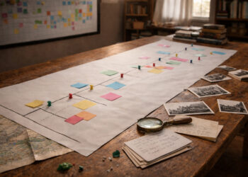
Timelines are powerful tools that make sequences and causality visible to learners and readers alike.
A well-crafted timeline clarifies relationships between events and highlights patterns across periods.
Educators, curators, and writers rely on timelines to condense complex histories into approachable narratives.
This article outlines practical principles for designing timelines that communicate clearly and engage audiences.
Why Timelines Matter
Timelines transform abstract dates into a visual story, helping viewers see progression and context at a glance. They support comparative thinking by aligning events across regions, themes, or institutions. In research and teaching, timelines condense large amounts of information into digestible segments, aiding memory retention and discussion. Clear timelines also help identify gaps in knowledge and guide further inquiry.
- Provide chronological anchors that orient readers quickly.
- Reveal simultaneity and cause-effect relationships across topics.
When used thoughtfully, timelines act both as summaries and starting points for deeper analysis. Their design should balance detail with readability so they remain useful across different audiences.
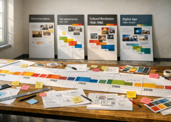
Designing a Clear Timeline
Begin by defining the scope: choose the time span, geographic focus, and the types of events to include. Prioritize entries that advance the narrative or illustrate turning points rather than every minor occurrence. Use consistent spacing and labels so intervals and durations are understandable; inconsistent scales confuse the viewer. Visual hierarchy—through color, size, or grouping—helps highlight crucial events without overwhelming the timeline.
- Decide on scale and stick to it to preserve proportional relationships.
- Group related events to reduce clutter and emphasize themes.
Simplicity supports comprehension: limit text, provide clear legends, and offer links or references for readers who want more detail. Interactive timelines can layer information without sacrificing initial clarity.
Common Pitfalls and Fixes
Overcrowding is a frequent issue: too many events make the timeline unreadable and obscure key patterns. Ambiguous dating or inconsistent formats undermine credibility and frustrate users. Neglecting context leaves audiences unsure why an item matters; brief explanatory notes can fix this. Finally, ignoring accessibility—such as color contrast and alternative text—limits who can benefit from your timeline.
- Avoid clutter by grouping or using expandable details.
- Standardize date formats and provide sources for entries.
- Design with accessibility in mind: contrast, fonts, and alt descriptions.
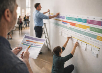
Reviewing timelines with peers or test users helps catch mistakes early and improves usability. Iteration ensures the final product communicates intent clearly to its audience.
Conclusion
Effective timelines combine careful selection, consistent design, and clear context to tell historical stories well.
They serve as both teaching aids and research tools when crafted with audience needs in mind.
Investing time in thoughtful layout and accessibility maximizes their impact and reach.