

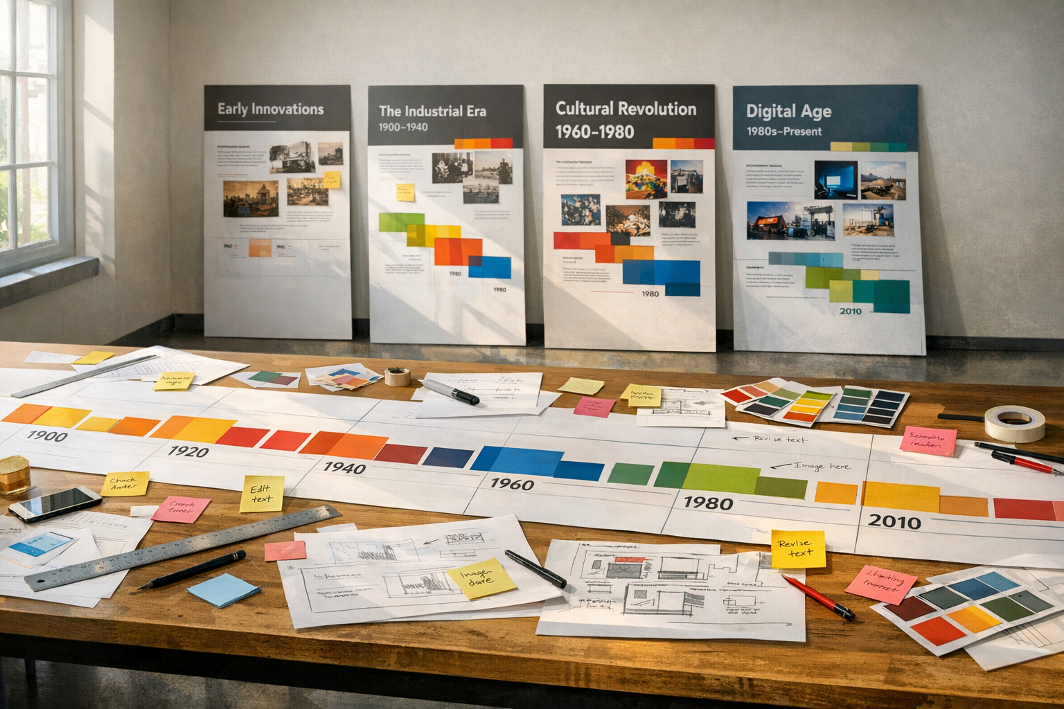
Timelines translate complex histories into visual stories that visitors can quickly grasp.
A well-designed timeline balances context, chronology, and selective detail to guide understanding.
Whether for an exhibit, website, or classroom, the goals are clarity, accuracy, and engagement.
Early planning around audience and medium shapes every decision from scope to visual hierarchy.
This article outlines practical principles that make historical timelines more useful and memorable.
Principles of Timeline Design
Start by identifying the narrative you want the timeline to convey. Select key events that support that narrative and avoid overwhelming users with every detail. Use consistent date formats and clear labels so visitors can scan and compare moments quickly. Provide brief contextual notes to explain why each event matters, and cite concise primary-source excerpts where they clarify significance. Where possible, link entries to deeper resources to let curious readers explore further.
- Prioritize events that illustrate change, causation, or turning points.
- Keep labels short and reserve longer explanations for expanded views.
A coherent hierarchy—headlines, dates, and annotations—helps prioritize information. Regularly test with representative users to confirm the intended message lands. Gather feedback from content experts as well to maintain accuracy and perspective.
Choosing Scale and Scope
Decide whether your timeline covers years, decades, or centuries and set a consistent scale. Shorter spans allow finer detail while longer spans require thematic grouping to avoid clutter. Consider how compound events or overlapping developments will be shown. Decide whether your timeline will be static or interactive, as that affects labeling and data structure. Labeling choices affect readability, so prefer simple, standardized terms.
- Focused period: 5–20 years for in-depth topics.
- Medium span: decades for cultural or technological trends.
- Long arc: centuries for broad overviews.
Choosing the right scope ensures users can see patterns without losing important turning points. Iteration helps refine which events to include or combine. Document decisions to keep future edits consistent.
Visual Clarity and Accessibility
Visual design dictates how easily visitors extract meaning. Use contrast, readable type sizes, and restrained color palettes to highlight relationships rather than distract. Offer multiple navigation aids, such as zoom controls or filtered views, to accommodate different interests. Ensure color choices meet contrast standards and provide textual alternatives for screen readers. Design for multiple screen sizes and optimize assets so timelines load quickly on constrained devices.
Accessible timelines expand their audience and improve comprehension for everyone. Test visual choices with accessibility tools and real users. Accessibility improvements often benefit all users, not just those with disabilities.
Conclusion
Thoughtful timelines are tools for making history intelligible and engaging.
By aligning narrative goals, scope, and visual clarity, designers can create effective displays.
Regularly testing and updating keeps timelines accurate and relevant over time.