Timelines are essential tools for making historical narratives accessible and understandable. A well-organized timeline helps audiences see patterns, connections, and turning points without overwhelming them. For public-facing projects, clarity, scale, and contextual accuracy determine whether a timeline informs or confuses. This article outlines practical approaches to organizing timelines that engage diverse audiences.
Principles of Clarity
When constructing a timeline, prioritize a single clear purpose: orientation, explanation, or comparison. Limit the number of simultaneous threads and avoid dense labels that require prior specialist knowledge. Use consistent date formats and clear event titles to reduce cognitive load for casual readers. Simplicity in structure allows readers to follow a narrative at a glance.
Iterate with real users to reveal where assumptions cause confusion. Small adjustments to wording and spacing often yield large comprehension gains.
Defining Scale and Scope
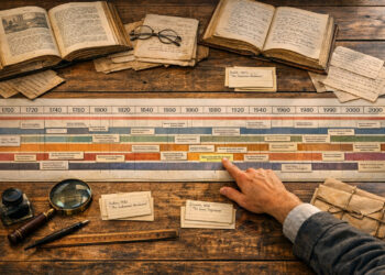
Deciding scale and scope shapes every other design choice. A local community timeline differs from a multi-century thematic timeline in both granularity and visual rhythm. Choose time intervals and event granularity that support your story: years for rapid change, decades or centuries for long-term trends. Be explicit about inclusion criteria so audiences understand why items appear.
- Micro: single-year or event-focused timelines for intensive study.
- Meso: multi-decade views good for social and technological trends.
- Macro: centuries or eras for broad patterns and comparisons.
Label the chosen scale prominently and allow users to zoom or filter where possible. Clear controls help reconcile depth with usability.
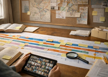
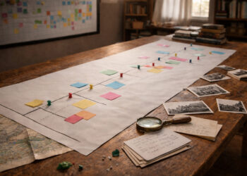
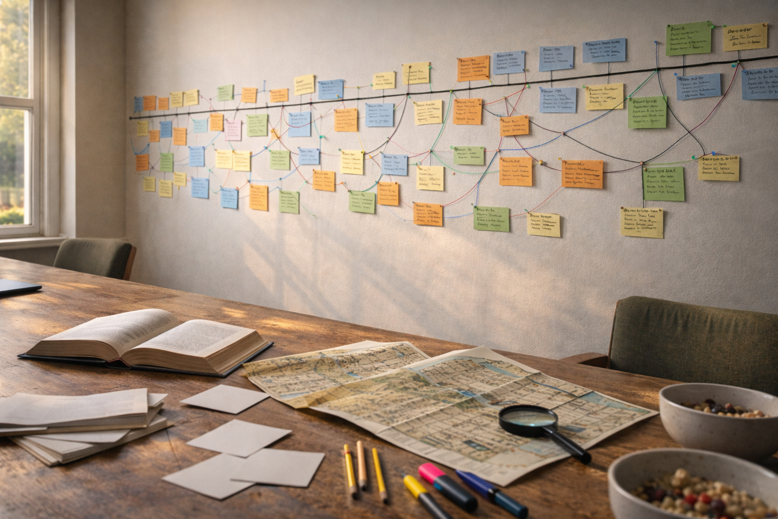
Designing Visual Hierarchy
Visual hierarchy guides attention and conveys importance. Use size, color, and spatial grouping to indicate primary narratives and secondary details. Lines and connectors should be minimal and purposeful to avoid visual noise. Typography choices—weight, size, and contrast—support scannability across devices.
Test contrast and legibility under different lighting and screen sizes. Accessibility-minded choices benefit all users.
Integrating Research and Context
A credible timeline balances narrative clarity with scholarly rigor. Cite sources where possible and provide links to deeper documentation for curious users. Contextual sidebars or short explanatory notes prevent events from appearing as isolated facts. Reassess entries as new research emerges to keep the resource current.
Transparency about sources builds trust with audiences and sponsors. Versioning or change logs help users track updates.
Engagement and Accessibility
Interactive features can deepen engagement, but they should enhance, not replace, clear structure. Filters, search, and layered detail let users explore at their own pace. Consider multilingual labels, keyboard navigation, and screen-reader compatibility from the start. Inclusive design increases reach and educational impact.
Balance novelty with predictability to avoid alienating less technical visitors. Measure engagement with analytics and qualitative feedback.
Conclusion
A successful public timeline combines clarity, appropriate scale, sound research, and thoughtful design. Regular user testing and iterative updates sustain relevance and trust. Approaching timelines as living interpretive tools will maximize their educational value.