
Timelines are a powerful way to make historical change legible, memorable, and easier to analyze for readers.
They help readers follow causation, compare parallel developments across different places and institutions, and locate events within broader periods.
Creating a compelling timeline requires careful choices about temporal scope, narrative voice, categorization, and visual emphasis to avoid misinterpretation.
This guide outlines practical steps to plan timelines that communicate context, suggest relationships, and invite further exploration through linked sources.
Clarify purpose and audience
Begin by defining what you want the timeline to achieve, which audiences you aim to serve, and the specific questions you want to answer.
A community exhibit needs different pacing, language, and interpretive framing than a scholarly research tool or an online educational resource.
Decide whether the timeline will prioritize discrete events, biographies, long-term social processes, or thematic developments across sectors.
These decisions determine the level of detail, the granularity of dates, and the spatial or temporal scale you will use in the layout.
Write clear, concise labels and avoid jargon that could confuse non-specialist visitors. Test wording and organization with representative users and revise accordingly.
Organize for narrative and context
Arrange entries to reveal relationships — sequences, proximate causes, continuities, and sudden ruptures that deserve emphasis.
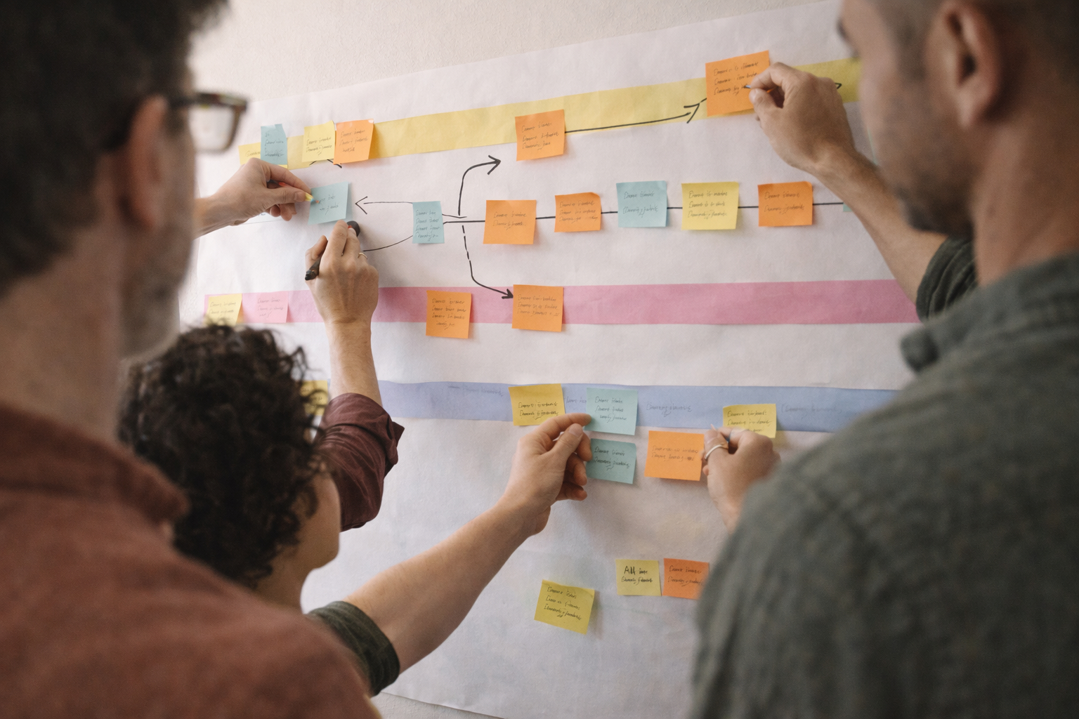
Group related events into thematic bands or layered tracks so readers can follow political, economic, social, and cultural threads in parallel.
Include brief contextual blurbs that explain why an event matters, how it connects to larger trends, and what sources support the interpretation.
Use focal markers for turning points and anchor them to background trends to maintain narrative momentum and prevent isolated anecdotes from dominating the story.
Ensure temporal spacing reflects significance as well as strict chronology so readers perceive uneven rates of change. Offer curated pathways for deeper dives into topics and sources.
Design for clarity and accessibility
Visual design should support, not overwhelm, the historical narrative, making choices that foreground meaning rather than decorative detail.
Choose a limited palette, consistent typography, and hierarchy of type sizes to guide the eye across time and to indicate relative importance.
Use symbols and icons sparingly, pair them with text labels, and provide a clear legend or alternative text for screen readers to enable independent decoding.
Consider color contrast, generous font size, and responsive layout so the timeline remains legible in printed panels, tablets, and small mobile screens.
- Prioritize readable fonts and adequate spacing.
- Provide alternative text and text-based versions.
- Test color combinations for sufficient contrast.
Conduct accessibility checks, involve people with diverse needs in testing, and iterate based on feedback. Small adjustments to contrast, labeling, and interaction design often improve comprehension significantly.
Conclusion
Thoughtful timelines balance accuracy with narrative clarity.
They make the past usable without oversimplifying it.
Iterate with users to refine both story and form.