Timelines are essential tools for organizing historical information and seeing connections over time.
A clear timeline helps learners identify causality, continuity, and change in events.
Thoughtful design balances detail and readability so readers can follow complex narratives.
This article outlines practical steps for building meaningful timelines for study or display.
Principles of Effective Timelines
Begin by defining the purpose of your timeline and the audience you expect to reach. Decide whether the goal is to show broad trends, a sequence of key events, or the interplay of multiple themes across the same period. Prioritize accuracy of dates and consistency in labeling to build trust and avoid confusion. Keep narrative clarity in mind so that each entry contributes to the overall story you want the timeline to tell.
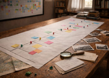
Establishing clear rules for inclusion helps maintain focus and prevents overcrowding. Use consistent units of time and avoid mixing unrelated scales without explanation. These choices make the timeline more usable for teaching, research, or exhibition purposes.
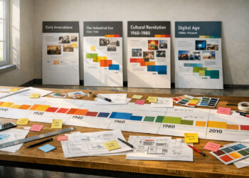
Setting Scale, Scope, and Sources
Choose a time span and granularity that match your objective: centuries for long-term change, years for political histories, or days for fast-paced conflicts. Select reliable primary and secondary sources and document them in a brief bibliography or notes section linked to entries. Where dates are uncertain, indicate ranges or differing interpretations rather than presenting a single contested date as fact. Clear scope and source transparency improve the timeline’s scholarly value and usability.
Being explicit about scope prevents the timeline from becoming a disorganized list. Consistent sourcing supports further research and gives users confidence in the material presented.
Design and Annotation Tips
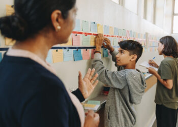
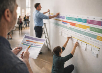
Visual design influences comprehension: use spacing, color, and grouping to signal relationships and highlight turning points. Add concise annotations to provide context without overwhelming the layout, and consider inset timelines or sidebars to track parallel developments. Interactive elements, if available online, can reveal deeper layers of information while keeping the main view uncluttered. Accessibility choices such as high-contrast palettes and readable fonts broaden the timeline’s audience.
- Use color to differentiate themes, not merely to decorate.
- Limit annotation length and offer links for more detail.
- Design mobile-friendly versions for wider accessibility.
Thoughtful annotation and careful visual choices help users engage with complex sequences and make comparisons across time. A well-designed timeline invites exploration rather than passive reading.
Conclusion
Clear goals, consistent sourcing, and careful design turn chronological data into meaningful narratives.
Prioritize readability and context to help users draw connections and insights from the timeline.
With these practices, timelines become powerful tools for learning and interpretation.